Coffee Table Book Layout: How to Design Pages That People Actually Want to Flip Through
Contents
- Coffee Table Book Layout: How to Design Pages That People Actually Want to Flip Through
- Why Most Coffee Table Books End Up As Decorative Dust Collectors
- The Foundation: White Space Is Your Best Friend (Not Your Enemy)
- Balancing Images and Text Without Losing Your Mind
- The Three Layout Approaches That Actually Work
- Creating Visual Rhythm That Keeps Pages Turning
- Typography: The Unsung Hero of Layout Design
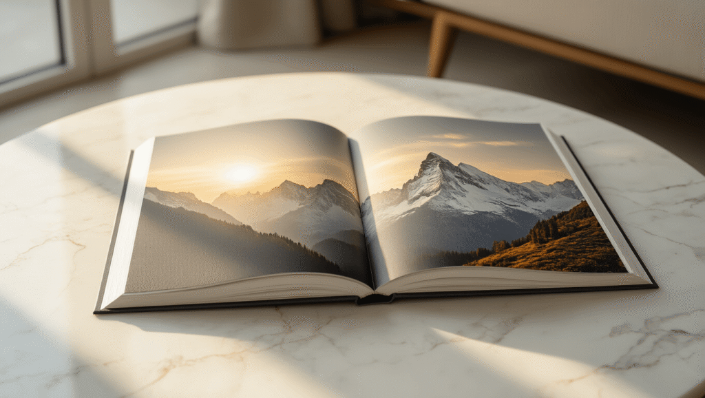
Coffee table book layout is the secret ingredient that transforms a pile of pretty pictures into something people can’t stop picking up.
I’ve spent years staring at coffee tables in bookstores, friends’ living rooms, and design studios, and I can tell you this: the books that get touched, opened, and actually looked at all share the same DNA in their layout design.
Why Most Coffee Table Books End Up As Decorative Dust Collectors
Let’s be honest. Most coffee table books sit there looking expensive and never get opened. And it’s not because the photos are bad. It’s because the layout is boring, cluttered, or just plain exhausting to look at.
Here’s what goes wrong:
- Too many images crammed onto each page
- Text that fights with photos for attention
- Predictable page after predictable page
- No breathing room for your eyes to rest
- Typography that screams “I picked the first font I saw”
The good news? Once you understand the fundamentals of coffee table book layout, you can avoid all of this.
The Foundation: White Space Is Your Best Friend (Not Your Enemy)
I used to think white space was wasted space. I was wrong. Dead wrong.
White space in coffee table book layout isn’t empty nothingness—it’s the breathing room that makes everything else pop. Think of it like the pauses in a great conversation. Without them, everything becomes noise.
When you’re designing your layout, negative space guides the reader’s eye exactly where you want it to go. It creates hierarchy, establishes focus, and prevents that overwhelming “where do I even look?” feeling.
Here’s how to use white space effectively:
- Leave generous margins around your images (minimum 0.5 inches, but often more)
- Don’t feel obligated to fill every corner of every page
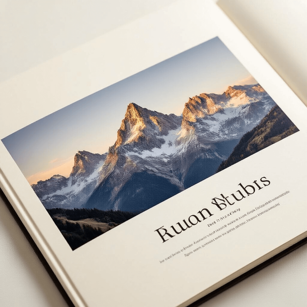
- Let a powerful image sit alone on a page without text
- Use white space to separate different sections or themes
- Create intentional “rest stops” between visually dense spreads
I learned this the hard way when I designed my first photography book and crammed three images on every spread. It looked like a high school yearbook. Not the vibe I was going for.
Balancing Images and Text Without Losing Your Mind
The eternal struggle of coffee table book layout: how much text is too much?
Images should always be the star of the show. Text plays a supporting role—providing context, sharing stories, adding depth—but it should never compete with your visuals.
Here’s my rule of thumb:
- Full-page or double-page spreads for your strongest images
- Coffee table books work best with 70-80% visual content
- Keep text blocks to 50-100 words max per spread
- Use captions strategically, not automatically
When you do include text, make typography your ally:
- Choose one or two fonts maximum (seriously, that’s it)
- Sans-serif fonts work beautifully for modern, clean aesthetics
- Serif fonts add elegance to classic or editorial styles
- Font size should be readable from 2-3 feet away
- Text color should complement, not clash with, your images
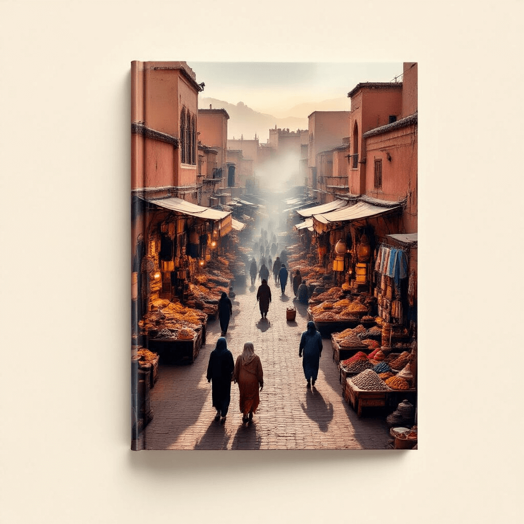
I once saw a stunning travel photography book completely ruined by lime green text. Don’t be that designer.
The Three Layout Approaches That Actually Work
Grid-Based Layouts: Structure Without Boredom
Grid systems are the backbone of professional coffee table book layout. They’re not restrictive—they’re liberating.
A 12-column grid gives you incredible flexibility:
- Divide into two 6-column sections
- Create three 4-column sections
- Mix full-width images with multi-column text
- Maintain consistency while varying layouts
Grid-based design works brilliantly for:
- Photography collections with similar image sizes
- Books with substantial text content
- Projects requiring organized, structured presentation
The key is using the grid as a guide, not a prison. Break it occasionally for dramatic effect.
Mixed-Layout Designs: Keeping Things Interesting
This is my personal favorite approach to coffee table book layout.
Mixed layouts combine different styles throughout the book:
- Full bleeds (images extending to page edges)
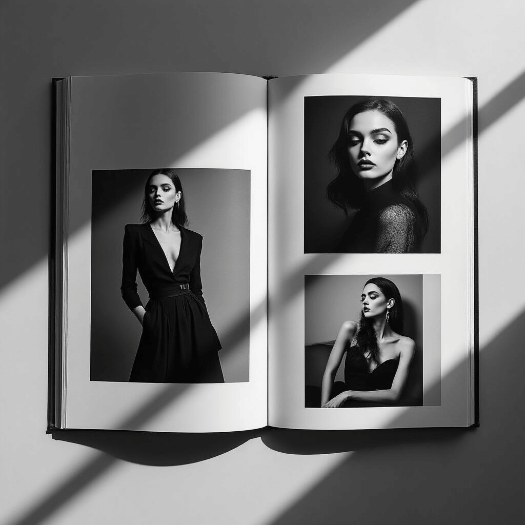
- Grid-based photo arrangements
- Minimalist single-image pages
- Text-heavy contextual spreads
- White space “palate cleansers”
This variety creates dynamic pacing that keeps readers engaged for the entire book. Nobody wants to flip through 100 pages of identical layouts.
I use mixed layouts when I want to:
- Tell a story with different visual rhythms
- Accommodate various content types
- Create emotional peaks and valleys
- Prevent reader fatigue
Singular-Focus Designs: When Less Is Definitely More
Sometimes the most powerful coffee table book layout is the simplest.
One image per spread. One idea per page. Maximum impact.
This approach works beautifully for:
- Fine art photography portfolios
- Architectural showcases
- Minimalist design projects
- Books where each piece deserves undivided attention
The danger? Boring your audience if the images aren’t strong enough to stand alone. Every single photograph needs to be exhibition-quality.
Creating Visual Rhythm That Keeps Pages Turning
Here’s something nobody tells you about coffee table book layout: orientation matters as much as content.
Mixing horizontal and vertical images prevents visual monotony:
- Landscape orientation for sweeping vistas and wide scenes
- Portrait orientation for vertical subjects and intimate moments
- Square formats for balanced, centered compositions
- Alternating orientations to create movement through the book
I plan my layouts like a DJ plans a setlist. You need energy peaks, calm moments, transitions, and surprises.
Try this sequence:
- Strong opening image (full spread, horizontal)
- Three smaller vertical images (grid layout)
- Single portrait image with white space
- Text-heavy contextual page
- Dramatic full-bleed surprise image
This creates a rhythm that feels intentional and keeps readers engaged.
Typography: The Unsung Hero of Layout Design
Bad typography can destroy even the most beautiful coffee table book layout. I’ve seen it happen.
Current trends favor bold, confident typefaces that can hold their own alongside striking imagery without overpowering it.
My typography checklist:
This post may contain affiliate links. Please see my disclosure policy for details.

